Taco Bell Totally Revamps Their Restaurants With These New Designs

When I was a small human, we had a Taco Bell right down the street from us that my family would go to at least once a week or two. My parents were in love with that place, and still are. They’re not huge on fast food, but they ain’t mad at Taco Bell. Contrary to popular belief, my family’s obsession with Taco Bell has not caused any rectal harm above and beyond the standard muddy runs from time to time, a small price we’re willing to pay.
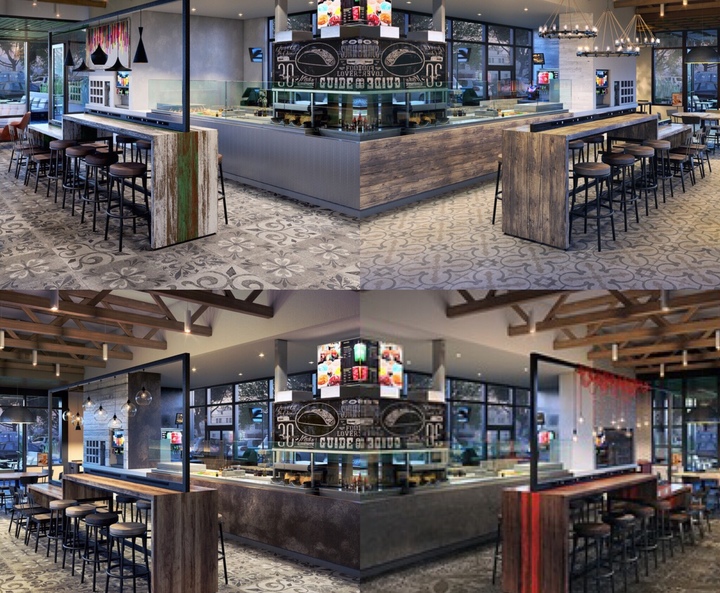
The thing I remembered most about the Taco Bell was the pueblo-style walls and the arch at the top with the infamous bell listlessly swinging from side to side below it. That Mission Revival style and look was iconic, and was a part of the company’s image for well over a decade. Well, Taco Bell has decided to try and recreate that memorable appearance by introducing four new designs to their stores’ look: Urban Edge, Heritage, Modern Explorer and California Sol.
- Urban Edge – This design represents an eclectic mix of international and street style. This style is inspired by timeless design coupled with elements of the urban environment.

- Heritage – Inspired by its culinary roots in Mexican-inspired food with a twist, this style is a modern interpretation of Taco Bell’s original Mission Revival style characterized by warm white walls with classic materials in the tile and heavy timbers.

- Modern Explorer – This rustic modern style is a refined version of the brand’s Cantina Explorer restaurants and can easily fit into a suburban or rural environment. This look is inspired by the farms that make the food.

- California Sol – Inspired by Taco Bell’s California roots and the California lifestyle, this design blurs the lines between indoor and outdoor. It’s a celebration of dining al fresco and embraces a laidback beachy feel both inside and out.

To be completely honest, I’m a bit baffled that these changes are so subtle and miniscule. I can always appreciate some nice subtlety, but in a situation like this, being more exuberant and grandiose would have been much more appealing in my opinion. I could probably find more differences between the two similar pictures in a Highlights magazine. While the small changes are nice, they’re simply…boring.
These new designs will be implemented into four different Taco Bell locations in Orange County, initially as a trial run, and will be reopened to the public this summer.


