


This Is What IHOP’S Fancy New Logo Looks Like
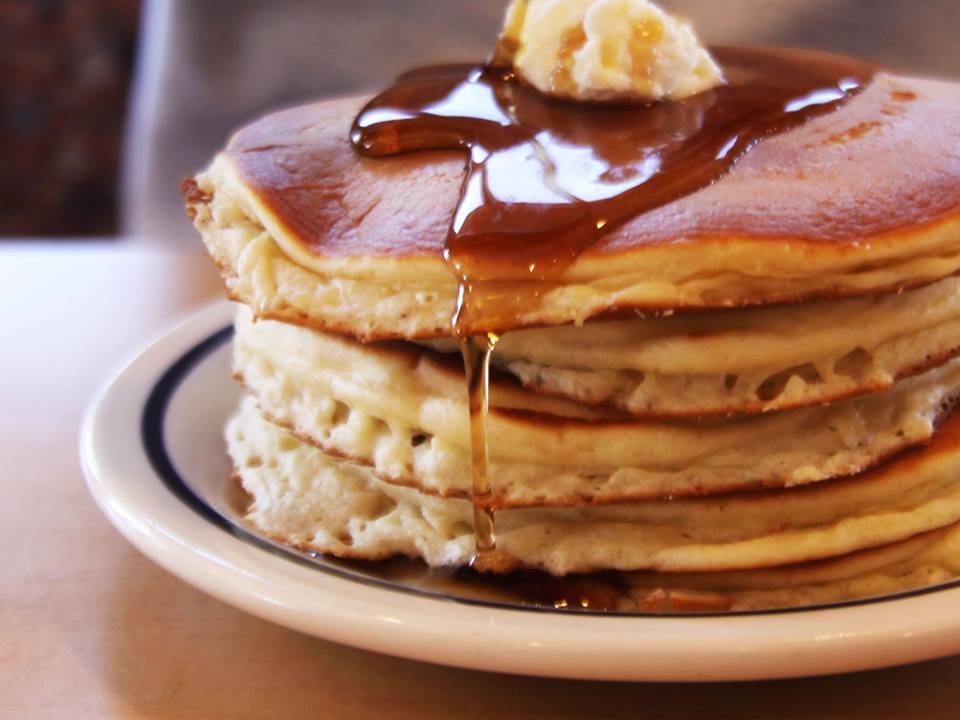

IHOP is known for its delicious pancakes and all day breakfast, but now it’s trying to also be known for its smile.
An IHOP spokesperson told Mashable that this is the first time they’ve rebooted the logo in 20 years, and the company was looking for a more modern feel while still keeping the familiar color scheme it’s had for 57 years.
__________
We’ve all become accustomed to this logo, with the blue background and white letters spelling out “IHOP.” There was always a red mustache-looking banner below it with the word “Restaurant” printed on it:

__________
IHOP flipped the colors, made the background white, the letters blue, got rid of the “Restaurant mustache” and lowkey added a face. The “O” and “P” act as the eyes and nose, while an upside down arch that looks like a red smile completes the happy face.

They’ve already added the logo to their social media sites, now we just have to see how it looks on the actual buildings.
h/t mashable