

If Premium Edition Pringles Existed, They Might Look Like This

Pringles: Premium Edition. The black label. The top shelf stuff. It’s almost like something out of a dream, am I right Pringles addicts?
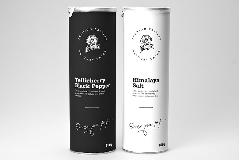
For the most part, this is just part of a dream. A dream envisioned and subsequently Inceptioned (if Pringles ever makes a premium line, then this term works perfectly) by Swedish design student Niklas Hessman. The product was created with a potential positioning that Pringles might have a need to compete with other brands and their subsequent ‘high end’ and eco-products they are bringing to the market.
The new design keeps the well known tube structure in tact, but gives the color scheme and artwork a huge minimalist play, opting for very neutral and contrasting black and white, and even staying true to the company’s slogan with cursive scroll reading “Once you pop…“
The alternative take on the traditional Pringles can boasts poetry under the package’s flavor title, instead of the Photoshopped effects of the cans we see today.
Would you care to see cans and flavors like these hit your local super markets? Or are Pringles fine just the way they are?


[via Niklas Hessman]