7-Eleven Gets Wooden Fruit Baskets and Aims for Millennials with Trader Joe-Esque Makeover
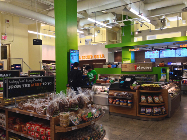
Yep, the hipster aesthetic is officially dead. For years, we’ve watched corporate logos get ironed out, flashy signage be replaced with adorable handwritten chalkboards. Love distressed wood? Congratulations, here are 500+ restaurants whose tables came all the way from the Himalayas! Best of all, at least half of them are the same corporate chains you already know and love (*cough, McDonald’s, Starbucks).
7-Eleven is just the latest chain to trade in its depressing, cost-efficient white walls and linoleum in favor of something a little “friendlier.” In a series of new concept stores nicknamed “7-Eleven Next Generation,” gone are the logo’s familiar green, red, and orange stripes, the cramped aisles, and (hopefully) the flies in the pastry box. Instead, Ohio-based design firm WD Partners has ushered in a brand new, Trader Joe’s-y vibe to everyone’s favorite convenience store, and even we have to admit, home-store looks goooood.

Design Taxi reports the redesign is meant to “reposition and rejuvenate” the brand and help it “better capture the millennial and female demographics.”
Which, okay, fine, makes sense. No one liked the gigantic stripes anyway, and picking fruit out of a wooden palette does seem quaint and farmer’s market-y. But maybe it’s still a little too trendy. Makes me miss the days when convenience stores sucked just the right amount to let you go inside willingly, but not want to spend more than five minutes there.


Luckily, branding blog Brand New reports there isn’t any indication this concept will be rolled out to all 7-Eleven (sorry, 7eleven) locations any time soon — just a few in New York’s Financial District and Chicago. So for now, let’s all continue to chug down our giant Slurpees in our oversized, MJ-scented hoodies. Quick, before the chicks in the make-up and yoga pants come through.
H/T Design Taxi + PicThx Brand New


